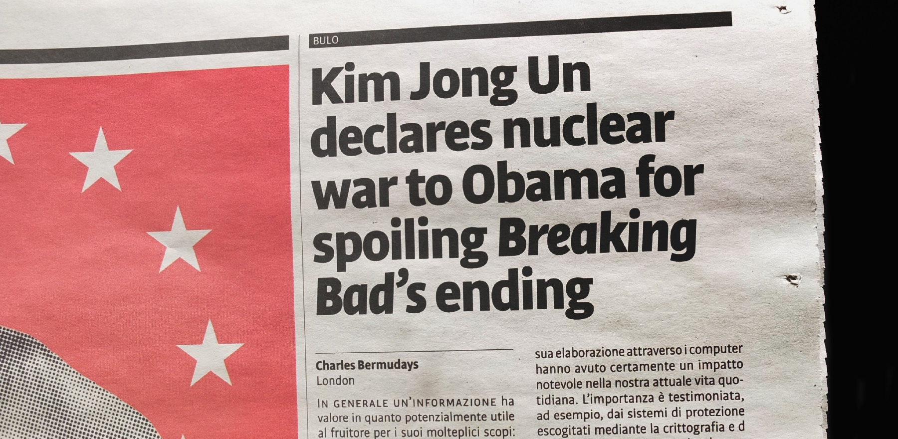
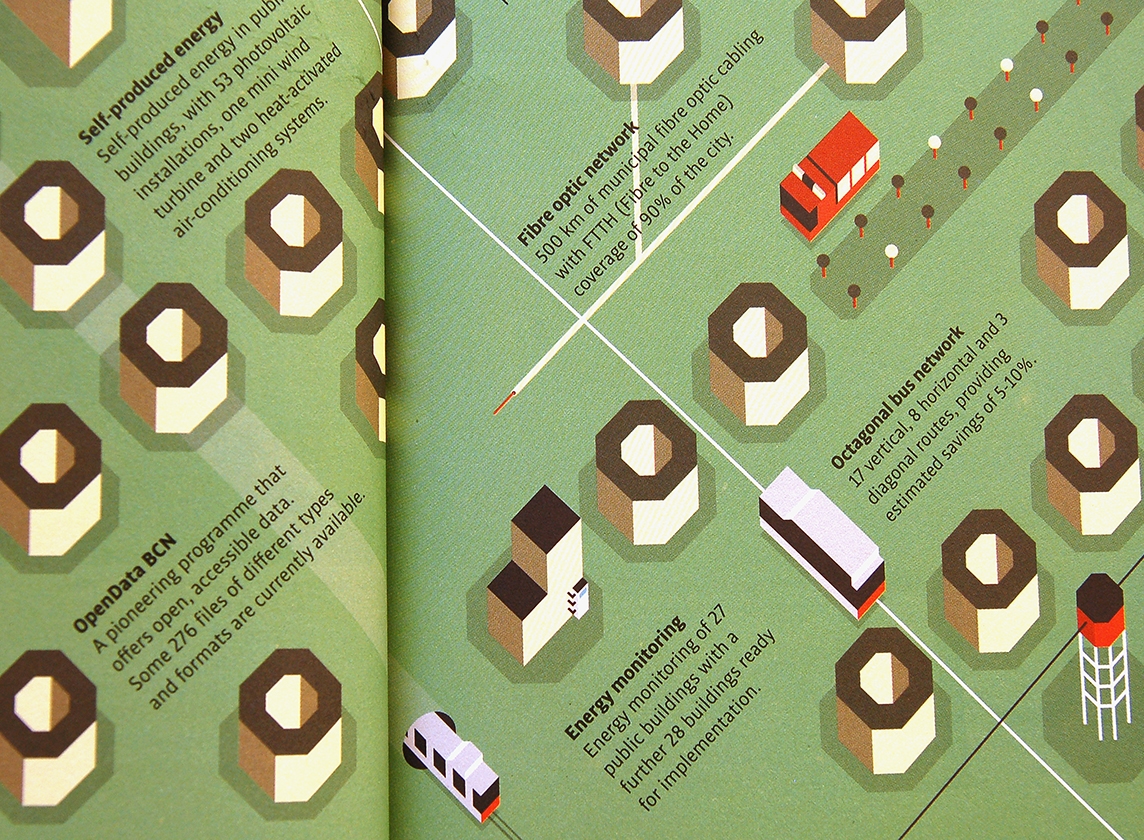
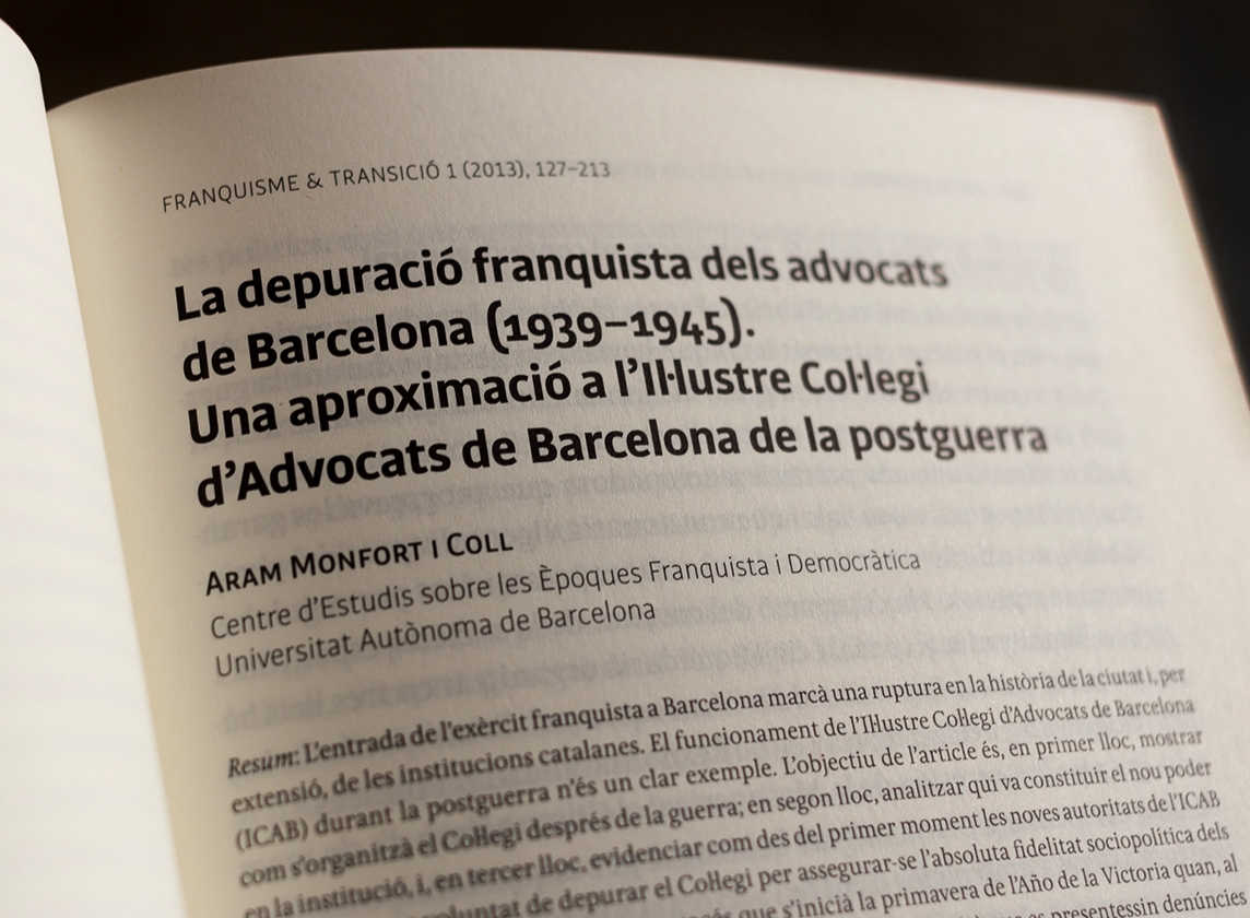
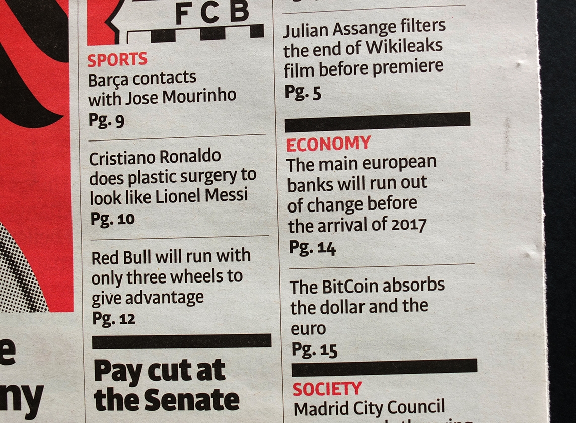
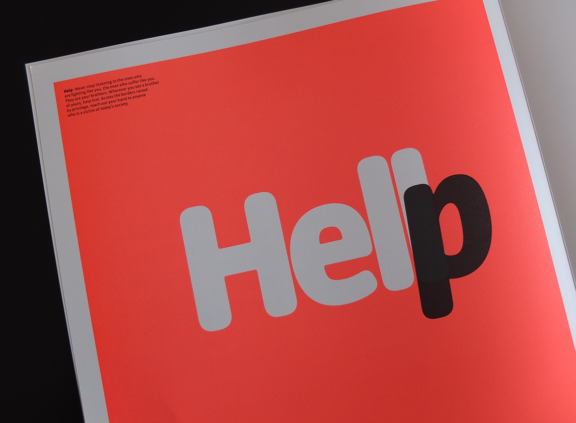
Bulo is a sanserif typeface with clear and concise letterforms. It follows a mechanically based construction, but with a slight humanistic touch, particularly in its lowercase and italics. It has been designed for newspaper and magazine contexts, thus the feature of economy in its use of space, both horizontal –through its narrow proportions– and vertical –with its short ascenders and descenders. In addition it has a generous x-height and reduced uppercase. Bulo Rounded is a Real Rounded. What I mean with real rounded is that not only the beginning and the end of the strokes are rounded, but also the counters and the intersections of the glyphs. The result is a smooth effect that brings warm feeling, and the rounded text is perceived in a logical and natural way.
Bulo
2 families of 20 and 10 styles
Year
2012
Design
Jordi Embodas, Noe Blanco
Script
Latin Super Extended with Small caps
Format
Desktop: otf, ttf. Webfonts: woff2 Variable Fonts


Bulo
Hair Blond
Voorbeelden van hardnekkige geruchten
Hair Blond Italic
Le voci possono essere di qualsiasi tipo
Hair Dark
L’histoire est au mieux tronquée
Hair Dark Italic
La sociedad ha aprovechado el anonimato
Thin
Det alternativa namnet klintbergare
Thin Italic
Men som kan være både sand
Light
La cronaca rosa è un genere giornalistico
Light Italic
Zur wissenschaftlichen Beschäftigung
Regular
In een roddelblad worden feiten en
Italic
Glasina je ukorijenjena na subjektivnoj
Medium
Unter dem Begriff Regenbogenpresse
Medium Italic
Keltainen lehdistö eli sensaatiolehdistö
Bold
La remor mai no té una font definida
Bold Italic
Spokrewnione z niniejszym jest
Black
Derimod viser samme oversigt
Black Italic
Não-ficção que são percebidos como
Extra Black
Nunca he cobrado nada en negro
Extra Black Italic
Messorgar implica un engan intencionat
Ultra Black
Embuste, bola, calumnia o falacia
Ultra Black Italic
Osoba, o kojoj se radi u glasini
Characterset
Uppercase
ABCDEFGHIJKLMNOPQRSTUVWXYZ
Accented Uppercase
ÁÀÂÄÃÅǍĀĂȂǺǞĄÆǼǢĆĈČĊÇĎḐḌÐÉÈÊËĚĒĔȆĖĘǴĜǦĞĠĢǤĤḤĦÍÌÎÏĨǏĪĬȊİỊĮĴJǨĶƘĹĽĻḶḸĿŁṂŃÑŇṄŅṆÓÒÔÖÕǑŌŎȎŐỌǪǬØǾŒŔŘȒŖṚṜŚŜŠȘŞṢŤŢṬŦÚÙÛÜŨŮǓŪŬȖŰŲỤẀẂŴẄÝỲŶŸỸŹŽŻŊÞƷǮƏ
Uppercase Punctuation
¿¡〈[{(‹«»›)}]〉!?-–—@
Currency
€$¢£¥
Lowercase
abcdefghijklmnopqrstuvwxyz
Accented Lowercase
áàâäãåǎāăȃǻǟąæǽǣćĉčċçďḑḍđéèêëěēĕȇėęǵĝǧğġģǥĥḥħíìîïĩǐīĭȋịįĵǰǩķƙĺľļḷḹŀłṃńñňṅņṇóòôöõǒōŏȏőọǫǭøǿœŕřȓŗṛṝśŝšșşṣßťţṭŧúùûüũůǔūŭȗűųụẃẁŵẅýỳŷÿỹźžżŋþðʒǯə
Lowercase Punctuation
¿¡[{(‹«»›)}]!? -–—.,:;…- ‘’“”‚„‘”•·/\|
‖¦*†‡§¶^_@©®℗™¤
‖¦*†‡§¶^_@©®℗™¤
Alternates
-
Ligatures
ff fi fl
Ligning Figures
1234567890
|1|2|3|4|5|6|7|8|9|0|
Oldstyle Figures
123456789
|1|2|3|4|5|6|7|8|9|0|
Scientific Inferiors, Denominators, Numerators & Superscripts
1234567890123456789012345678901234567890
Standard Fractions
½ ¼ ¾
Ordinals
№ªº
Mathematical Symbols
+−±×÷=≠~≈<>≤≥¬
Δ#°Ωμπ∞∂∫√∑∏◊ ℮ℓ % ‰
Δ#°Ωμπ∞∂∫√∑∏◊ ℮ℓ % ‰
Opentype
—A la 2a 1/2 de la dècada dels 90 (del segle xx), s’inventa el format Opentype que ofereix múltiples variants tipogràfiques dins d’un única arxiu font. Les característiques Opentype ofereixen la possibilitat d’enriquir textos substituïnt i ofereix diversos tipus de numerals: 0123456789. També pot incorporar versaletes, lletres alternatives, i puntuació adaptades a les caixes tipogràfiques. Les nostres fonts incorporen les característiques essencials per maquetar text amb garanties.
Languages
- Afrikaans
- Basque
- Breton
- Catalan
- Croatian
- Czech
- Danish
- Dutch
- English
- Esperanto
- Estonian
- Faroese
- Finnish
- French
- Galician
- German
- Greenlandic
- Hungarian
- Icelandic
- Gaelic
- Italian
- Laotian
- Latin
- Maori
- Marshallese
- Norwegian
- Occitan
- Polish
- Portuguese
- Romanian
- Romansch
- Scots
- Serbian
- Slovak
- Slovenian
- Spanish
- Swedish
- Wolof
- Albanian
- Bosnian
- Indonesian
- Latvian
- Maltese
- Turkish
- Uzbek
Fonts in use

Licenses
Bulo
Server, OEM, Broadcasting, Streaming, Corporate or Global Advertising license? Please contact us for more information.
Total0,00 €