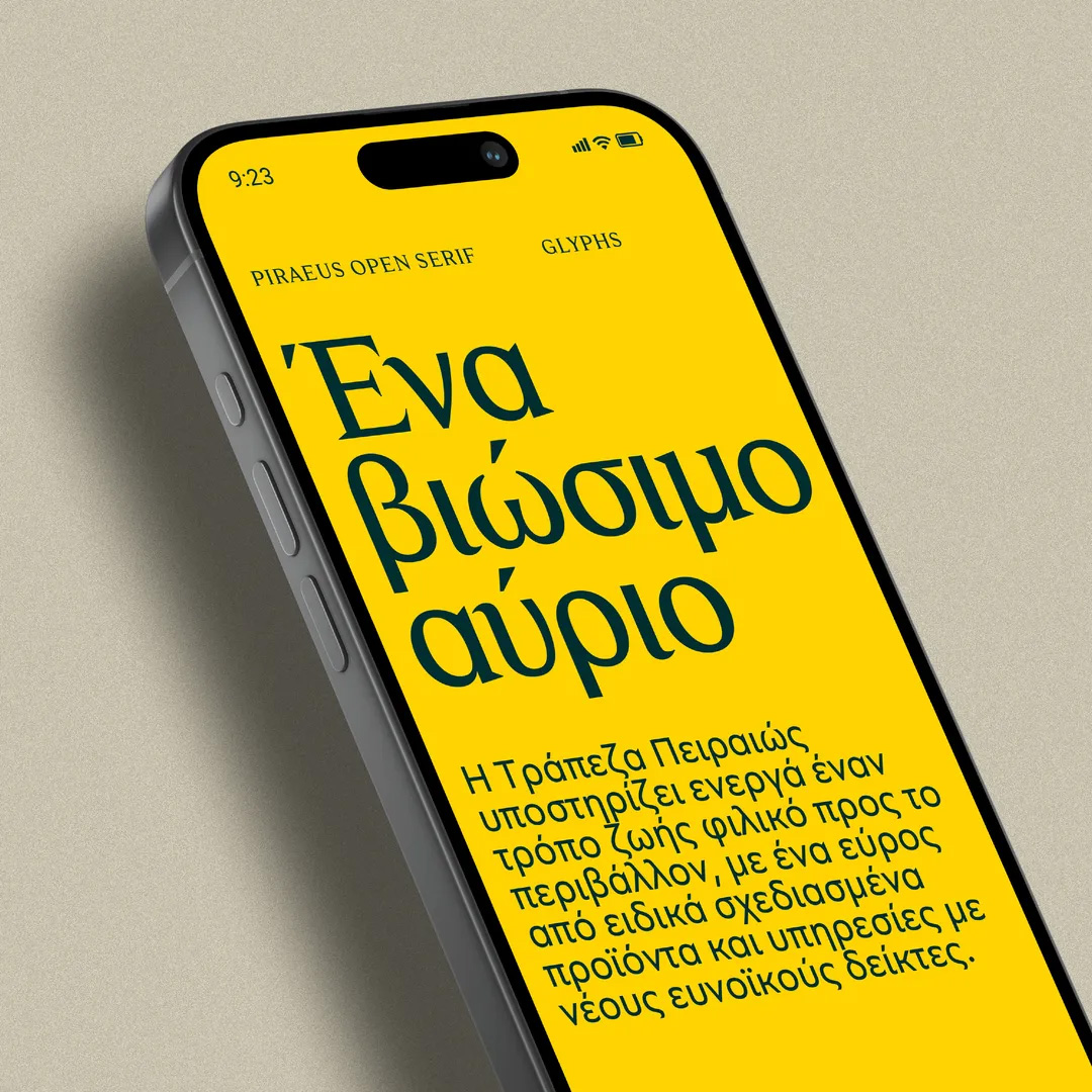
Piraeus Bank new brand include two new custom fonts: Piraeus Open Serif emerges from the characters of the logotype and evolves into a robust and richly nuanced typographic set. Combining classic elements with a contemporary twist, exudes an aura of serenity and trustworthiness. Effectively conveying the distinct identity of Piraeus.
Piraeus Open Sans derives from the primary Serif style, yet it takes on a wider form to ensure readability across a range of content and devices. While it exhibits a structure reminiscent of geometric sans-serifs, exuding a neutral and professional appearance, it also introduces a distinct oblique axis that infuses a touch of Mediterranean charm, lending it a more human and approachable character.