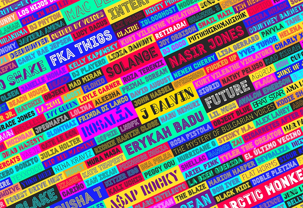
Development of a constructive typographic system with over 50 typographic weights. The versatile typeface allowed for variations and combinations, with each typographic family representing the diverse musical styles present at the festival. This approach intended to mirror the vernacular of live music venues' outdoor signs and labels, reflecting the essence of Primavera Sound. The new font system offered the freedom to integrate various festival brands into a unified visual ecosystem, enabling the creation of consistent merchandising, services, products, or content.


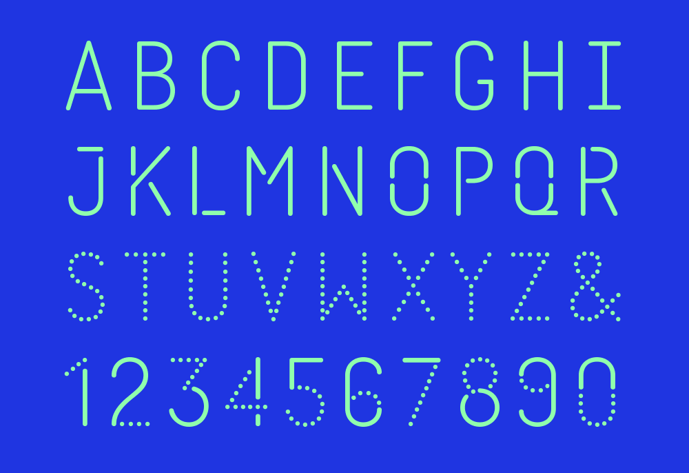
For the names of the main typographic styles, Mucho proposed to use names of the different musical styles, so that when they are mixed together, adding the different characteristics, the names also generate hybrid musical styles, which naturally also exist. Since the system includes so many styles, there are also other new names.
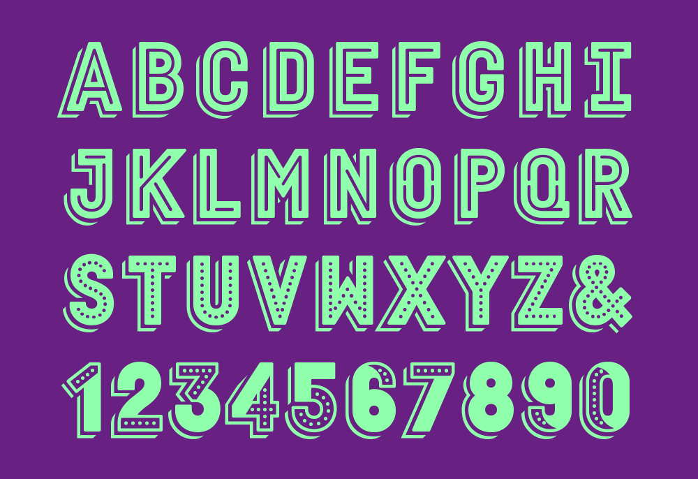


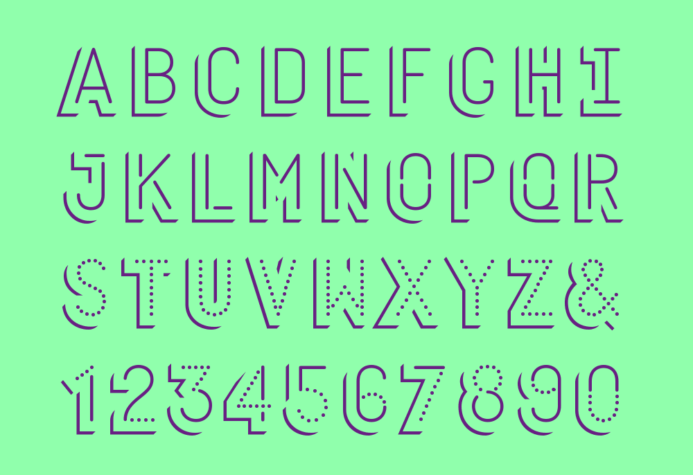
There are also a layer of styles with shadows called “urban”.