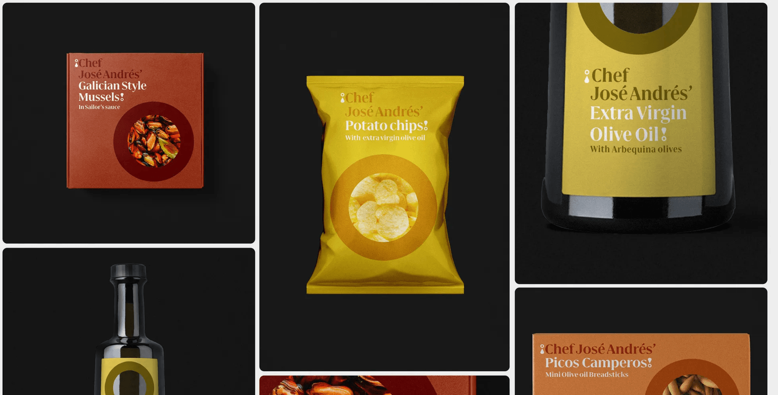
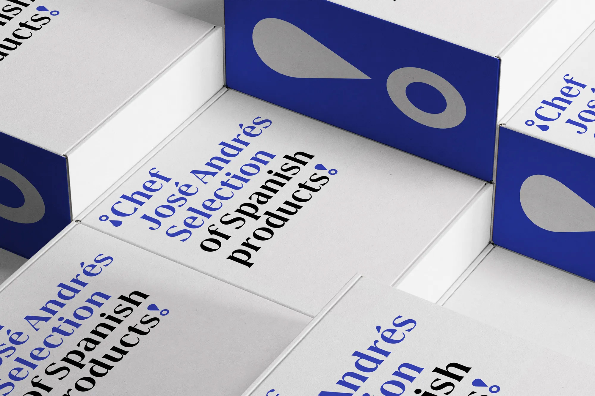
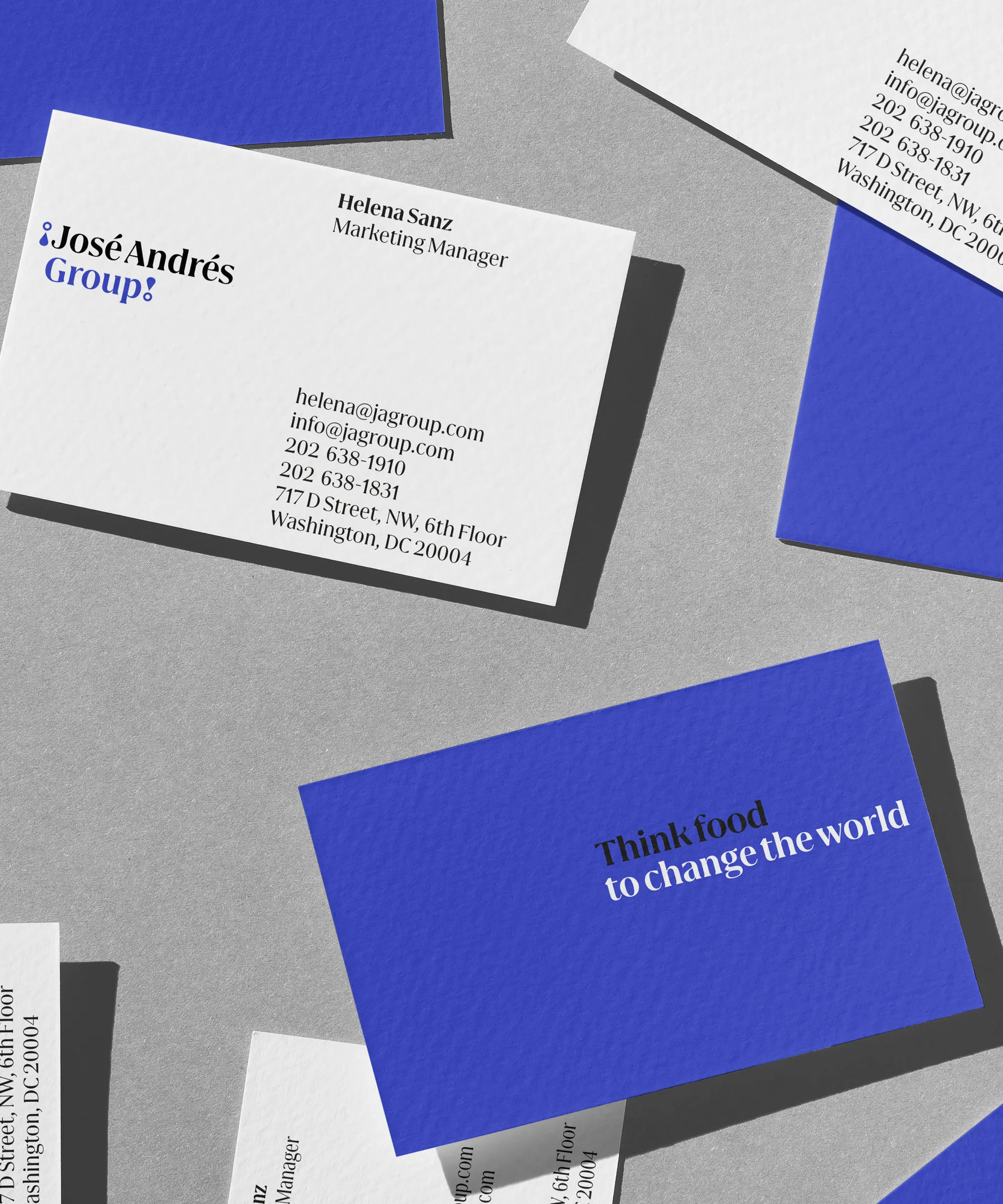
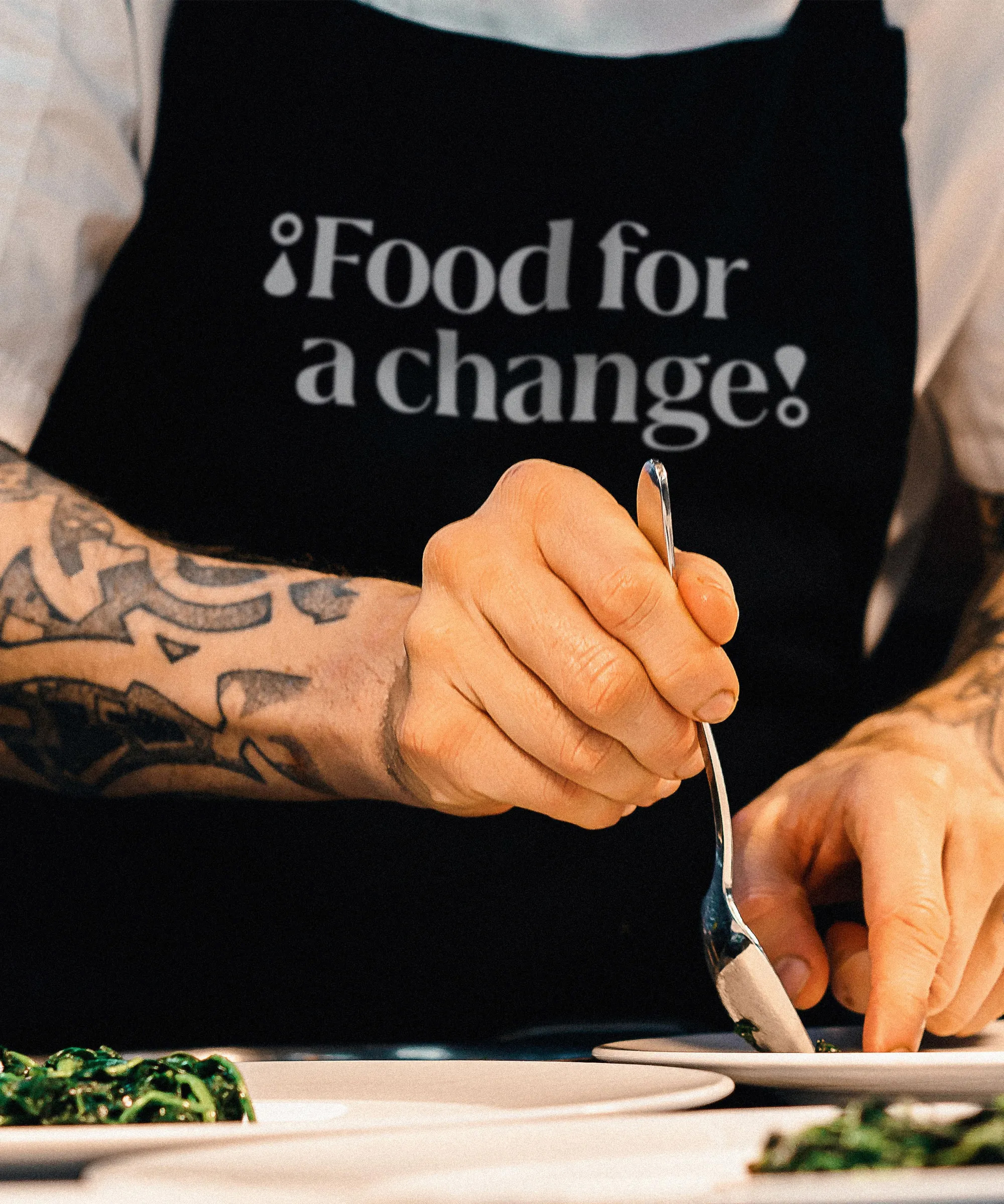
Mieres, the name of the hometown of Chef José Andrés, is the bespoke typeface create for the José Andrés Group. The new branding created by Mucho in 2023, uses Mieres fonts to capture the brand’s values. Mieres is an elegant & contemporary type family that combines in its forms, on the one hand, the combative and vindictive character with the incised and triangular serif terminals, and, on the other hand, other drop-shaped terminals that give it much more tasteful and sophisticated connotations. This social and gastronomic duality, gives Mieres a unique singularity.

Mieres Family consist in three weights with matching italics, plus a bold stencil to have an accentued reivindicative voice!


Asterisk represent the spirit of the typeface. The equilibrate combination between round and sharp terminals.


The typography has a powerfull singularity to type all brands and become an unique flavour.